We want our clients to truly know who we are. We are known in the market for our service and quality of product, but it seems that clients and suppliers are surprised when they see first hand the production capacity of our facilities, the number of quality controls and the attention to detail on our manufacturing processes.
In the year of our 50th anniversary we think it’s the moment to renew our corporate identity to better reflect and represent the Contibronzes of today. A modern, flexible, international company that is committed to quality and innovation.
This year we present our new brand identity to communicate to the market that we are evolving as a company. We have updated the brand while maintaining its essence. We are looking to communicate customer proximity and transmit a more technical and professional side, simplifying the logos and opting for smoother and more pleasing typography.
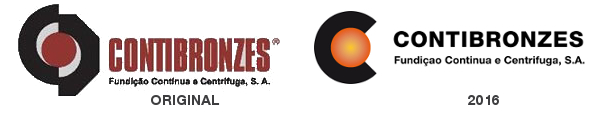
We have simplified the graphic element leaving only half of the circle and the point of bronze colour. Additionally, we have more fully closed the half circle on the left to resemble the letter C and it acts as if it were the initial of the company’s name. For the typeface, we have opted for more rounded letters with increased kerning to give the logo a more modern and familiar look.
We hope you like the change!
